

The landing page vs website question really starts with one thing: what is your ad asking people to do? If the campaign sells one service to one audience, a focused destination usually makes that easier. If people need to compare services, locations or options first, a broader part of your website may serve them better.
A landing page doesn’t need its own domain or a new platform. It can sit inside the website you already have. The real decision is about what happens after the click, and what someone needs to understand before they take the next step.
Short version: send people to whatever best continues the promise in your ad and helps them make the decision you’re asking for. A dedicated landing page makes sense when the offer needs its own explanation. A strong service or location section you already have may do the job just as well.
Define the destination by the visitor’s task
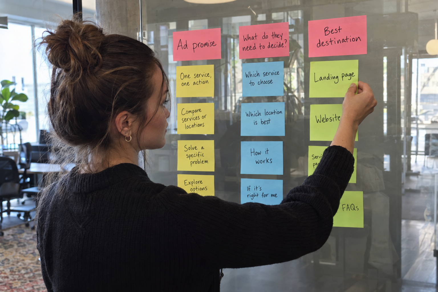
In ad platforms, the landing page is simply wherever someone arrives after clicking. In campaign planning, people usually mean something narrower: a destination built around one offer and one main action. Your website, by contrast, holds the full picture of the business across many sections.
That leaves you with more than two choices. An ad can point to the front of your website, an existing service section, a location listing or a brand-new campaign destination. Framing it as "one standalone landing page or the whole website" skips the options that are often the most practical.
Picture a New York home-service business advertising one specific repair. The person clicking wants to know three things: do they handle this repair, do they serve my address, and how do I reach them? Sending that person to the front of the site, where six service categories compete for attention, makes them dig. A relevant service section can answer them straight away.
Now picture an ad that introduces a business with several locations and a wide range of services. Here the visitor may need to pick a branch or compare options before getting in touch. Strip out every route to that information and a focused-looking destination becomes less useful, not more.
| Destination | Useful when | Main risk to check |
|---|---|---|
| Front of the website | People are exploring the business broadly | The specific offer in the ad gets buried |
| Existing service section | The service and next step already match the campaign | It describes a wider offer than the ad |
| Location listing | Availability and contact routing depend on the branch | Visitors land at the wrong location |
| Dedicated landing page | One audience needs a particular offer explained | Trust or decision details get cut |
The planning question is simple: what does this person need to decide next? Write the answer down before you pick a destination. If it lists several unrelated actions, the campaign itself probably needs a sharper focus.
Use what you already have when it fits

Every new destination you build has to be maintained. Someone has to keep the offer current, test the contact route and update it when the service changes. If your site already covers the offer well, improving that section is often the better move.
Read the proposed destination as if the ad were the only thing you’d seen. Is the advertised service obvious? Is the service area right? Does it answer the questions the ad raises? Can someone take the next step without wandering through unrelated parts of the site?
An existing section can also bring useful depth. People making a bigger purchase often want to learn about the company, see past work or compare service details. A focused campaign doesn’t make those needs go away, and navigation that supports a real decision is a help, not a leak.
This is where web design and development meets campaign planning. The structure of the site should serve what the visitor is trying to do. A redesign shouldn’t be the automatic answer to every new ad group, and a campaign shouldn’t be pushed onto the front of the website just because it’s already there.
Google treats landing page experience as the relevance and usefulness of the destination in its Quality Score guidance. Calling something a landing page doesn’t create that experience. A well-written service section can beat a newly built destination with a thin explanation.
Check who owns it, too. If the service section is already kept up to date by the people who run that offer, keeping campaign traffic there means fewer conflicting details. A separate campaign destination needs an equally clear owner so its claims don’t drift away from the main site.
Build a dedicated landing page when the offer needs its own explanation

A dedicated landing page earns its place when your existing site can’t present the offer clearly without confusing other visitors. That might be a distinct audience, a limited service package or a geographic offer that needs its own explanation.
Say a service business runs one campaign for commercial property managers and another for homeowners. Both involve the same trade, but the questions behind each decision are different. A dedicated destination can explain the right scope and contact path without making every visitor wade through both versions.
It still has to say clearly who the business is and give enough information for a sensible decision. Removing the navigation is no substitute for a convincing offer. Don’t hide important conditions, and don’t make people fill in a form before they understand what’s on offer.
Google’s destination requirements call for working, useful destinations that people can navigate. A campaign destination has to work on the devices your audience uses and offer real value, not just pass visitors along. Broken forms or technical blocks hurt either option.
A New York campaign also needs accurate coverage. If the offer only applies in certain areas, say so. Don’t imply there’s a local office where the business has none; you can describe a real service area without inventing a physical presence.
If you’re weighing PPC management in NYC, the destination decision sits right next to the offer and the targeting. A tightly focused destination can’t rescue an ad shown to the wrong people, and great targeting can’t make up for a destination that never explains the promised service.
Before anyone starts designing, write a short brief: who the visitor is, what the ad offers, the main action, the information needed to decide and who will maintain it. If those points are still fuzzy, another mockup won’t settle the real choice.
Compare results using the same business outcome

A dedicated landing page isn’t automatically the better converter. It’s a bet on what will help this audience make this decision. Test it against a suitable existing destination once the campaign has enough activity for a fair comparison.
Keep the comparison honest. If the audience, ads, bids and budget all change at the same time as the destination, you won’t know what caused the result. Record what changed, and don’t credit the destination with something the test can’t isolate.
Decide what counts as a conversion before you read the numbers. A button click, a completed form and a qualified inquiry are different things. A destination that produces more forms can still deliver fewer good prospects if its message sets the wrong expectations.
- Confirm the phone and form routes work on the live site.
- Measure both destinations the same way.
- Review lead quality, not just submission totals.
- Allow for the usual delay between a visit and an inquiry.
- Check that each destination’s offer stayed current during the test.
If traffic is too thin for a reliable test, admit it. A handful of visits can’t crown a winner. You can still catch obvious problems with a practical review: an offer that’s no longer available, a mobile form that breaks, or a contact button that sends people to the wrong branch.
Think about upkeep, too. A campaign destination that performs well but keeps going out of date creates its own problem. The right choice has to stay accurate long after launch, when the design attention has moved on.
Pick the metric closest to the campaign’s goal that the business can verify. For a service business, that’s usually a qualified inquiry or a booked job. Use earlier actions to diagnose the path, not as stand-ins for the real outcome.
Make the choice before starting the design
For your next campaign, write the ad’s promise in one sentence. Open the most relevant part of your existing site and ask whether it keeps that promise. Keep it if it does, improve it if the gaps are small, or build a dedicated landing page if the offer needs its own explanation.
Max Pull Marketing works across paid advertising and conversion-focused website design. The best starting point is the customer decision the campaign has to support; once that’s clear, choosing the destination becomes a practical design and measurement call.
Planning your next paid campaign? Contact Max Pull Marketing for a campaign and landing page review to make sure your destination is ready before the budget starts running.